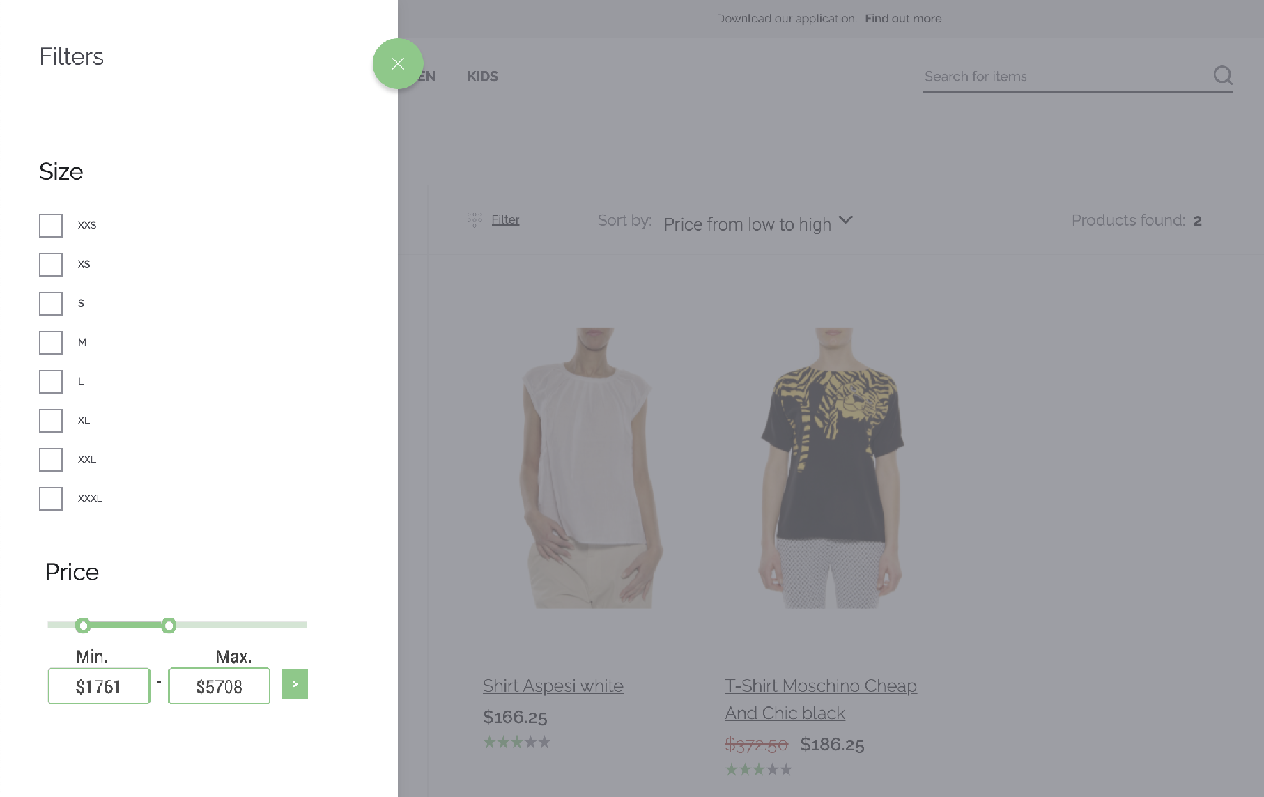
¶ Range filters
This filter type is applicable to numeric attributes or pseudo-attributes like "price".
¶ Basic UI
The range filter UI should follow this design.
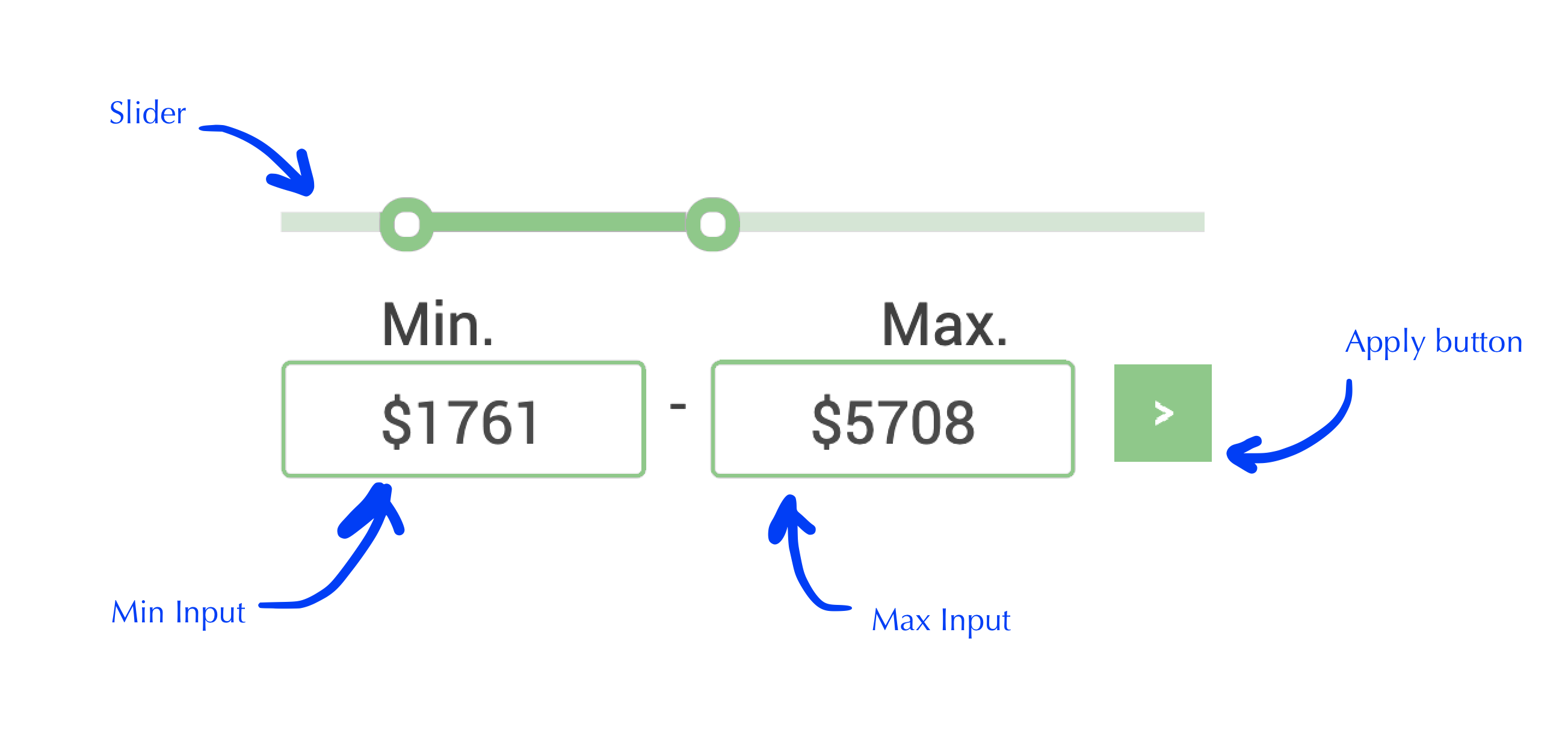
¶ Slider
- The slider component controls the minimum and maximum limits.
- When the slider left control is on the left limit, it means no minimum limit is applied.
- When the slider right control is on the left limit, it means no maximum limit is applied.
- When the slider changes one of their values, filter is applied without needing to click on the apply button.
¶ Min Input
- The min input controls the minimum limit for the attribute value.
- Changes are applied when clicked on the ">" button or pressing Enter.
- When the input value changes, the slider is automatically synced the corresponding value.
- The input must support an optional currency symbol when entering a number. If the attribute needs a currency symbol and it is not entered, it is added when filter is applied or input lost focus.
- The input can be empty to not limit the minimum value.
¶ Max Input
- The max input controls the maximum limit for the attribute value.
- Changes are applied when clicked on the ">" button or pressing Enter.
- When the input value changes, the slider is automatically synced the corresponding value.
- The input must support an optional currency symbol when entering a number. If the attribute needs a currency symbol and it is not entered, it is added when filter is applied or input lost focus.
- The input can be empty to not limit the maximum value.
¶ Apply Button
- When clicked the current filter is applied.
¶ General Guidelines
- Use the Vue Storefront Next colors and control styles.
- Minimum and maximum limits are inclusive.
- The location of the range filter could be anywhere in the filter sidebar, even mixed between Option filters.