¶ Admin Input Types
This document specifies the different input types used in the Admin as field inputs, including UI, UX, configurability, and when relevant, details about the internal behavior. All input components that are not used as input for fields (such as grid search boxes) are not part of this specification.
Goals of this document:
- Being able to specify behavior without knowing details of the implementation.
- Being able to validate behavior of the UIs when testing.
- Have a clear understanding of the expected behavior of the input components for developers and other roles.
Content:
¶ Text Inputs
All the inputs whose values can be enteded by typing, and there are no predetermined list of possible values.
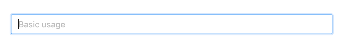
¶ Free Text One-Line Input
The simplest input to enter a single line of text.
¶ Component Options
- UI:
- Placeholder:
[string, optional]The light colored text to show when the input is empty. Defatuls to"".
- Placeholder:
- Behavior:
- Allow Empty:
[boolean, optional]Used to specify if the field supports the empty text""as a valid value to store (true) or if the field must be removed from the entity when the input is empty (false). Defaults tofalse. Note that this option does not control if the value is required or not. It manages how to deal with the empty value.
- Allow Empty:
- Validations:
- Required:
[boolean, optional]Specifies if the input requires to have a non-empty string as value. That is, at least one character length. Defaults tofalse. - Min. Length:
[number, optional]Specifies the minimun length for the input value. If not present, no validation for minimum length is performed. - Max. Length:
[number, optional]Specifies the maximun length for the input value. If not present, no validation for minimum length is performed. - Pattern:
[string, optional]Specifies a regex to validate the value. If not present, no pattern validation is performed. - Pattern Error Message:
[string, optional]Specifies the error message to show when the value does not follow the specified pattern. If not present, the input must show a generic message informing that the value does not follow the pattern.
- Required:
¶ Use Cases
- Enter name, lastname, and other free form one-line texts in a form.
- Enter the code to identify a product attribute.
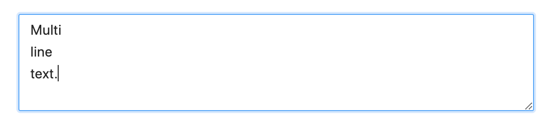
¶ Free Text Multi-Line Input
Multi-line input to enter a free text.
¶ Component Options
- UI:
- Placeholder:
[string, optional]The light colored text to show when the input is empty. Defatuls to"". - Expandible Vertically:
[boolean, optional]Determines if the UI of the input has a handler on the right-bottom corner to expand the hight of the component. Defaults tofalse. - Expandible Horizontally:
[boolean, optional]Determines if the UI of the input has a handler on the right-bottom corner to expand the width of the component. Defaults tofalse.
- Placeholder:
- Behavior:
- Max. Lines:
[number, optional]Used to set the maximum number of lines to enter. If not present, there is no restriction about the lines allowed. - Allow Empty:
[boolean, optional]Used to specify if the field supports the empty text""as a valid value to store (true) or if the field must be removed from the entity when the input is empty (false). Defaults tofalse. Note that this option does not control if the value is required or not. It manages how to deal with the empty value.
- Max. Lines:
- Validations:
- Required:
[boolean, optional]Specifies if the input requires to have a non-empty string as value. That is, at least one character length. Defaults tofalse. - Min. Length:
[number, optional]Specifies the minimun length for the input value. If not present, no validation for minimum length is performed. - Max. Length:
[number, optional]Specifies the maximun length for the input value. If not present, no validation for maximum length is performed. - Pattern:
[string, optional]Specifies a regex to validate the value. If not present, no pattern validation is performed. - Pattern Error Message:
[string, optional]Specifies the error message to show when the value does not follow the specified pattern. If not present, the input must show a generic message informing that the value does not follow the pattern.
- Required:
¶ Use Cases
- Enter a long description of a product.
- Enter comments related to an order update.
- Enter instructions of an address.
- Enter a rich/HTML description of a page.
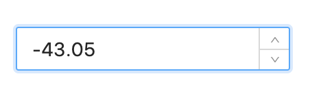
¶ Numeric Input
Input to enter a number. It supports direct typing of digits, and also has increment/decrement handlers.
¶ Component Options
- UI:
- Placeholder:
[string, optional]The light colored text to show when the input is empty. Defatuls to"".
- Placeholder:
- Validations:
- Required:
[boolean, optional]Specifies if the input requires to have a non-empty value. Defaults tofalse. When the numeric input is emptied, the field is not included in the entity. - Minimum:
[number, optional]Specifies the minimun numeric value allowed. If not present, no validation for minimum is performed. - Maximum:
[number, optional]Specifies the maximun numeric value allowed. If not present, no validation for minimum is performed. - Allow Negative:
[boolean, optional]Specifies if the input allows to enter negative numbers. Defaults totrue. This option may sound redundant with "Minimum", but keeping them separate helps control the semantics of the field and also the error messages. - Allow Decimal:
[boolean, optional]Specifies if the input allows to enter decimal numbers (not only integer). Defaults totrue.
- Required:
¶ Use Cases
- Enter the age of a person.
- Enter the price of a product.
- Enter any numeric product attribute.
¶ Dropdown Lists
All the inputs whose values are selected from a list. The user can only select values from the provided list.
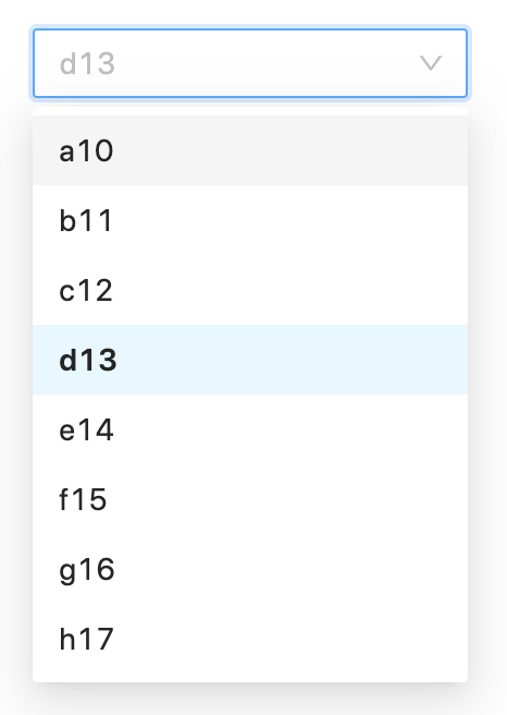
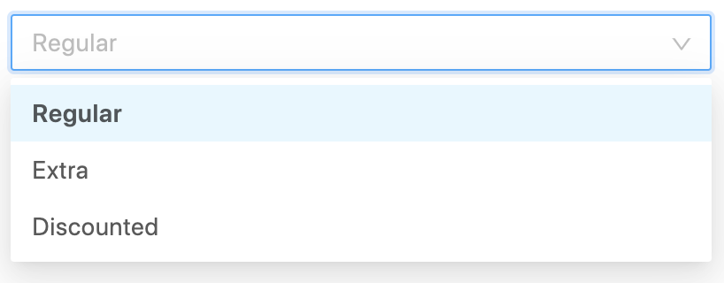
¶ Dropdown Fixed List Single Select
The simplest dropdown to select a single item from a fixed list of options.
To be used with lists that rarely change, and has relatively few items.
¶ Component Options
- UI:
- Placeholder:
[string, optional]The light colored text to show when no option is selected. Defatuls to"".
- Placeholder:
- Behavior:
- Options:
[{ value: string, label: string }[], optional]Array of fixed options that are loaded at once when the component is rendered. The options does not change and are specified directly as a fixed array of value-label object. The option labels are used to show the list of options. The option values are used as the component value, so they're the actual values to store. - Allow Empty:
[boolean, optional]Used to specify if the field supports the empty text""as a valid value to store (true) or if the field must be removed from the entity when the input is empty (false). Defaults tofalse. Note that this option does not control if the value is required or not. It manages how to deal with the empty value. - Default First:
[boolean, optional]Used to indicate if by default the first option must be selected, instead of showing the placeholder. If it istrue, the "Placeholder" option is ignored, since it will always be a selected option. Defaults tofalse.
- Options:
- Validations:
- Required:
[boolean, optional]Specifies if the input requires to have a non-empty option as value. That is, the selected option has a value with at least one character length. Defaults tofalse.
- Required:
¶ Use Cases
- Select the type for a new product.
- Select the type for a new attribute.
- Select a country.
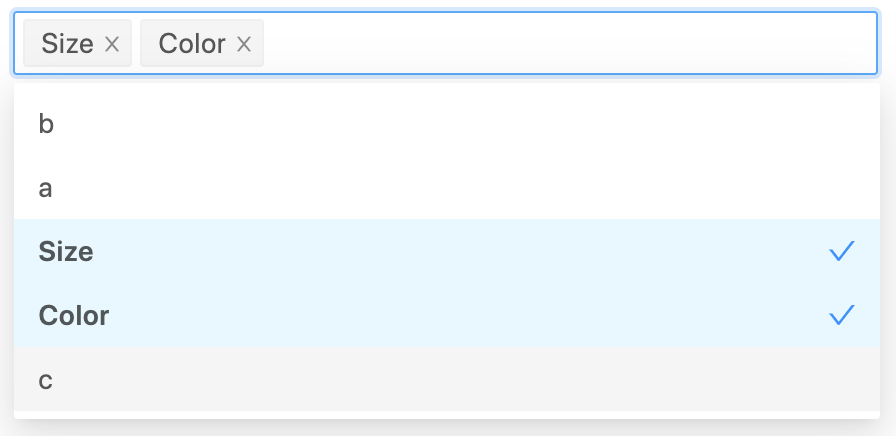
¶ Dropdown Fixed List Multi-Select
Multi-select dropdown to choose a sorted sub-set of options from a fixed list.
To be used with lists that rarely change, and has relatively few items.
¶ Component Options
- UI:
- Placeholder:
[string, optional]The light colored text to show when no options are selected. Defatuls to"".
- Placeholder:
- Behavior:
- Options:
[{ value: string, label: string }[], optional]Array of fixed options that are loaded at once when the component is rendered. The options does not change and are specified directly as a fixed array of value-label object. The option labels are used to show the list of options. The option values are used to conform a the component value as an array of the selected option values in the order they are shown in the component input panel. - Allow Empty:
[boolean, optional]Used to specify if the field supports the empty array[]as a valid value to store (true) or if the field must be removed from the entity when there are no selected options (false). Defaults tofalse. Note that this option does not control if the value is required or not. It manages how to deal with the empty array value. - Max. Selected:
[number, optional]Specifies the maximun number of selected options. This would be equivalent to the maximum length of the array value of the component. If not present, the number of selected item is not validated.
- Options:
- Validations:
- Required:
[boolean, optional]Specifies if the input requires to have at least one option selected. Defaults tofalse.
- Required:
¶ Use Cases
- Select a list of supported currencies.
- Select a list of countries.
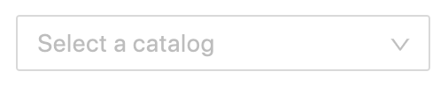
¶ Dropdown Dynamic List Single Select
Dropdown to select a single item from a list of options retrieved from a service or other data source.
To be used with lists that rarely change, and has relatively few items.
This one is very similar to the "Dropdown Fixed List Single Select", but here the list is not hard-coded in the code.
¶ Component Options
- UI:
- Placeholder:
[string, optional]The light colored text to show when no option is selected. Defatuls to"".
- Placeholder:
- Behavior:
- Options Callback:
[() => { value: string, label: string }[], optional]Asynchonous function that returns an array with all the possible options that are loaded at once when the component is rendered. The options are not supposed to change frequently, so the component should call this callback only once. The option labels are used to show the list of options. The option values are used as the component value, so they're the actual values to store. - Allow Empty:
[boolean, optional]Used to specify if the field supports the empty text""as a valid value to store (true) or if the field must be removed from the entity when the input is empty (false). Defaults tofalse. Note that this option does not control if the value is required or not. It manages how to deal with the empty value. - Default First:
[boolean, optional]Used to indicate if by default the first option must be selected, instead of showing the placeholder. If it istrue, the "Placeholder" option is ignored, since it will always be a selected option. Defaults tofalse.
- Options Callback:
- Validations:
- Required:
[boolean, optional]Specifies if the input requires to have a non-empty option as value. That is, the selected option has a value with at least one character length. Defaults tofalse.
- Required:
¶ Use Cases
- Select a price type.
- Select a region inside a country.
- Select a product attribute.
¶ Dropdown Dynamic List Multi-Select
Multi-select dropdown to choose a sorted sub-set of options from a list of options retrieved from a service or other data source.
To be used with lists that rarely change, and has relatively few items.
This one is very similar to the "Dropdown Fixed List Multi-Select", but here the list is not hard-coded in the code.
¶ Component Options
- UI:
- Placeholder:
[string, optional]The light colored text to show when no options are selected. Defatuls to"".
- Placeholder:
- Behavior:
- Options Callback:
[() => { value: string, label: string }[], optional]Asynchonous function that returns an array with all the possible options that are loaded at once when the component is rendered. The options are not supposed to change frequently, so the component should call this callback only once. The option labels are used to show the list of options. The option values are used as the component value, so they're the actual values to store. - Allow Empty:
[boolean, optional]Used to specify if the field supports the empty array[]as a valid value to store (true) or if the field must be removed from the entity when there are no selected options (false). Defaults tofalse. Note that this option does not control if the value is required or not. It manages how to deal with the empty array value. - Max. Selected:
[number, optional]Specifies the maximun number of selected options. This would be equivalent to the maximum length of the array value of the component. If not present, the number of selected item is not validated.
- Options Callback:
- Validations:
- Required:
[boolean, optional]Specifies if the input requires to have at least one option selected. Defaults tofalse.
- Required:
¶ Use Cases
- Select a set of price types.
- A list of product attributes.
- A list of attribute sets.
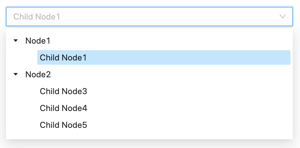
¶ Dropdown Dynamic Tree Single Select
Single select dropdown with tree selection.
The selected node could be either internal or leaf.
To be used with lists that rarely change, and has relatively few items.
¶ Component Options
- UI:
- Placeholder:
[string, optional]The light colored text to show when no option is selected. Defatuls to"".
- Placeholder:
- Behavior:
- Data Callback:
[() => { value: string, label: string, children: [] }[], optional]Asynchonous function that returns the tree data with all the possible options that are loaded at once when the component is rendered. The options are not supposed to change frequently, so the component should call this callback only once. The option labels are used to show the nodes in the tree. The option values are used as the component value, so they're the actual values to store. - Allow Empty:
[boolean, optional]Used to specify if the field supports the empty text""as a valid value to store (true) or if the field must be removed from the entity when the input is empty (false). Defaults tofalse. Note that this option does not control if the value is required or not. It manages how to deal with the empty value.
- Data Callback:
- Validations:
- Required:
[boolean, optional]Specifies if the input requires to have a non-empty option as value. That is, the selected node has a value with at least one character length. Defaults tofalse.
- Required:
¶ Use Cases
- Select a category.
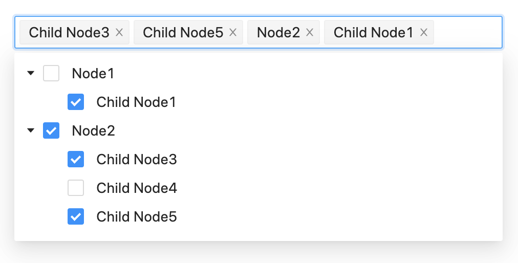
¶ Dropdown Dynamic Tree Multi-Select
Multi-select dropdown with tree selection.
The selected nodes could be either internal or leaf.
There are no dependency between internal and leaf nodes.
To be used with lists that rarely change, and has relatively few items.
¶ Component Options
- UI:
- Placeholder:
[string, optional]The light colored text to show when no option is selected. Defatuls to"".
- Placeholder:
- Behavior:
- Data Callback:
[() => { value: string, label: string, children: [] }[], optional]Asynchonous function that returns the tree data with all the possible options that are loaded at once when the component is rendered. The options are not supposed to change frequently, so the component should call this callback only once. The option labels are used to show the nodes in the tree. The option values are used to conform the array that represents the value of the component, so they're the actual values to store. - Allow Empty:
[boolean, optional]Used to specify if the field supports the empty array[]as a valid value to store (true) or if the field must be removed from the entity when there are no selected options (false). Defaults tofalse. Note that this option does not control if the value is required or not. It manages how to deal with the empty array value. - Max. Selected:
[number, optional]Specifies the maximun number of selected options. This would be equivalent to the maximum length of the array value of the component. If not present, the number of selected item is not validated.
- Data Callback:
- Validations:
- Required:
[boolean, optional]Specifies if the input requires to have at least one node selected. Defaults tofalse.
- Required:
¶ Use Cases
- Select a sub-set of categories.
¶ Search Boxes
All the inputs whose values are taken from a list of entities that can be searched. The user input text is used to search on the list.
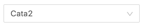
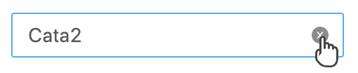
¶ Search Box Single Select
Search box with single selection.
Allow to select an option from a dynamic list.
New values cannot be entered, the entered text is only to search in the list.
No selection
Searching / selecting
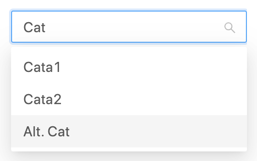
Value selected
Deleting value / clearing input
- UI:
- Placeholder:
[string, optional]The light colored text to show when no option is selected. Defatuls to"".
- Placeholder:
- Behavior:
- Options Callback:
[(filter) => { value: string, label: string }[], optional]Asynchonous function that returns an array with a sub-set of the possible options to choose using the component. The returned options corresponds to the parameterfilter. The options could change frequently, so the component should call this callback every time the its needed. The option labels are used to show the list of options. The option values are used as the component value, so they're the actual values to store. - Allow Empty:
[boolean, optional]Used to specify if the field supports the empty text""as a valid value to store (true) or if the field must be removed from the entity when the input is empty (false). Defaults tofalse. Note that this option does not control if the value is required or not. It manages how to deal with the empty value. - Min. Query Length:
[number, optional]Used to specify how many characters the user needs to type before the component search for suggestions using the "Options Callback". If is set to0, the suggestions are shown as soon as the component is focused. Defaults to3. - Suggestion Time:
[number, optional]The number of milliseconds that have to pass after the las typing is done. Defaults to200. - Max. Results:
[number, optional]The maximum number of options (suggestions) to show. Used to limit the results when the applied filter could return to many items. Defaults to10.
- Options Callback:
- Validations:
- Required:
[boolean, optional]Specifies if the input requires to have a non-empty option as value. That is, the selected option has a value with at least one character length. Defaults tofalse.
- Required:
¶ Use Cases
- Select a product.
- Select a customer.
- Select a city in the world.
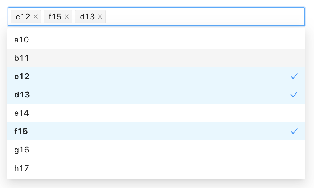
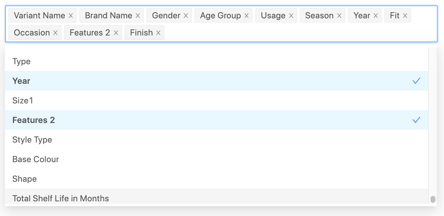
¶ Search Box Multi-Select
Search box with multiple selection.
Allows to select a set of sorted options from a dynamic list.
New values cannot be entered, the entered text is only to search in the list.
- UI:
- Placeholder:
[string, optional]The light colored text to show when no option is selected. Defatuls to"".
- Placeholder:
- Behavior:
- Options Callback:
[(filter) => { value: string, label: string }[], optional]Asynchonous function that returns an array with a sub-set of the possible options to choose using the component. The returned options corresponds to the parameterfilter. The options could change frequently, so the component should call this callback every time the its needed. The option labels are used to show the list of options. The option values are used as the component value, so they're the actual values to store. - Allow Empty:
[boolean, optional]Used to specify if the field supports the empty array[]as a valid value to store (true) or if the field must be removed from the entity when there are no selected options (false). Defaults tofalse. Note that this option does not control if the value is required or not. It manages how to deal with the empty array value. - Min. Query Length:
[number, optional]Used to specify how many characters the user needs to type before the component search for suggestions using the "Options Callback". If is set to0, the suggestions are shown as soon as the component is focused. Defaults to3. - Suggestion Time:
[number, optional]The number of milliseconds that have to pass after the las typing is done. Defaults to200. - Max. Results:
[number, optional]The maximum number of options (suggestions) to show. Used to limit the results when the applied filter could return to many items. Defaults to10. - Max. Selected:
[number, optional]Specifies the maximun number of selected options. This would be equivalent to the maximum length of the array value of the component. If not present, the number of selected item is not validated.
- Options Callback:
- Validations:
- Required:
[boolean, optional]Specifies if the input requires to have a non-empty array as value. That is, the selected option has a value with at least one character length. Defaults tofalse.
- Required:
¶ Use Cases
- Select several products.
- Select customers.
- Select companies.