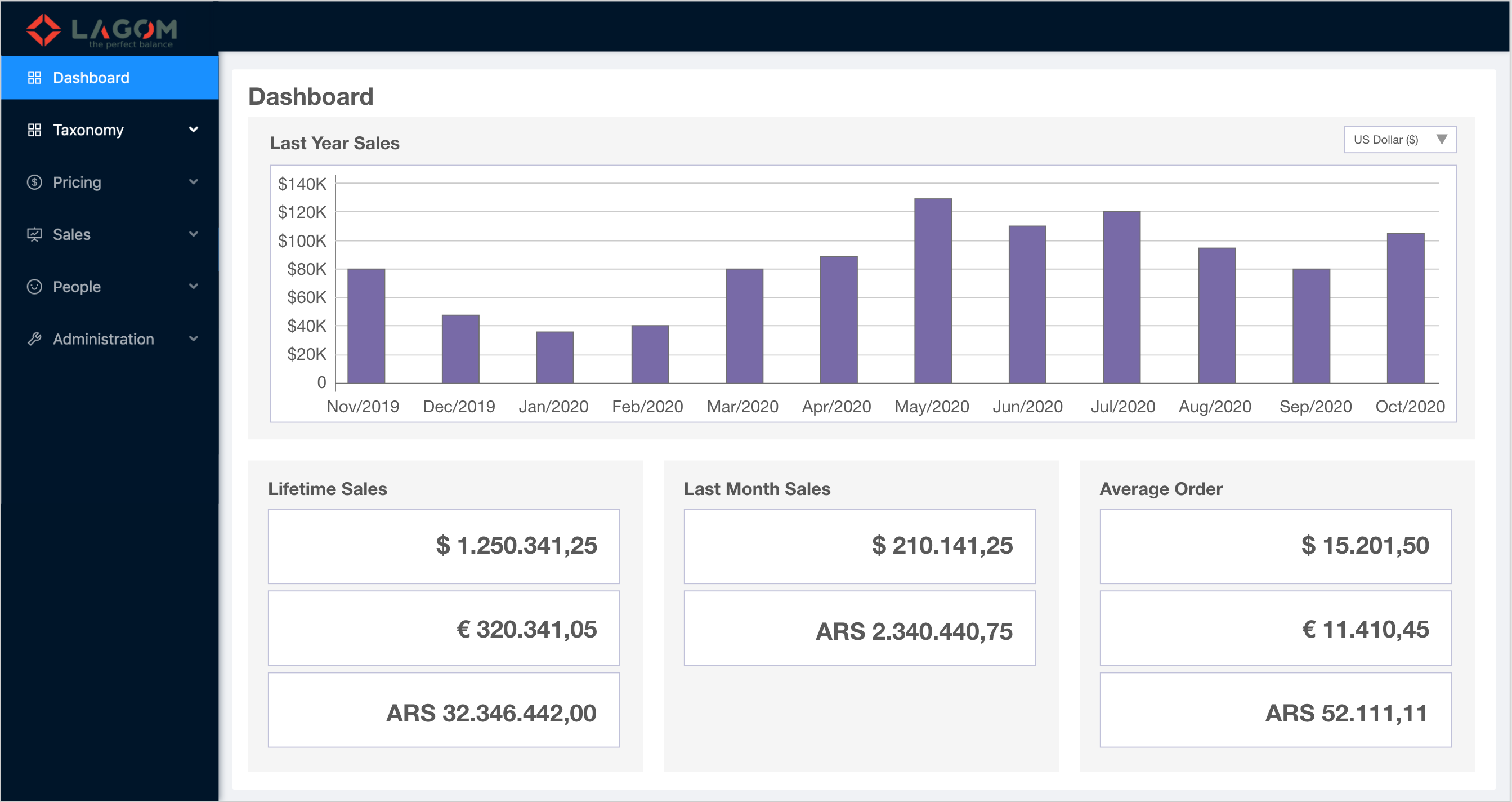
¶ Dashboard Screen
General view of Admin Dashboard.
-
The Dashboard will be accessible through a new sidebar menu item "Dashboard" that will be placed at the beginning.
-
The icon for the new menu item is
 , corresponding to the React Ant Design icon:
 <FundOutlined />. -
The information to fill up all the dashboard sections will be provided by the API following this specification of Summary Report.
¶ Sections
The Dashboard is conformed by these sections:
- Title bar
- Chart
- Lifetime Sales
- Last Month Sales
- Average Order
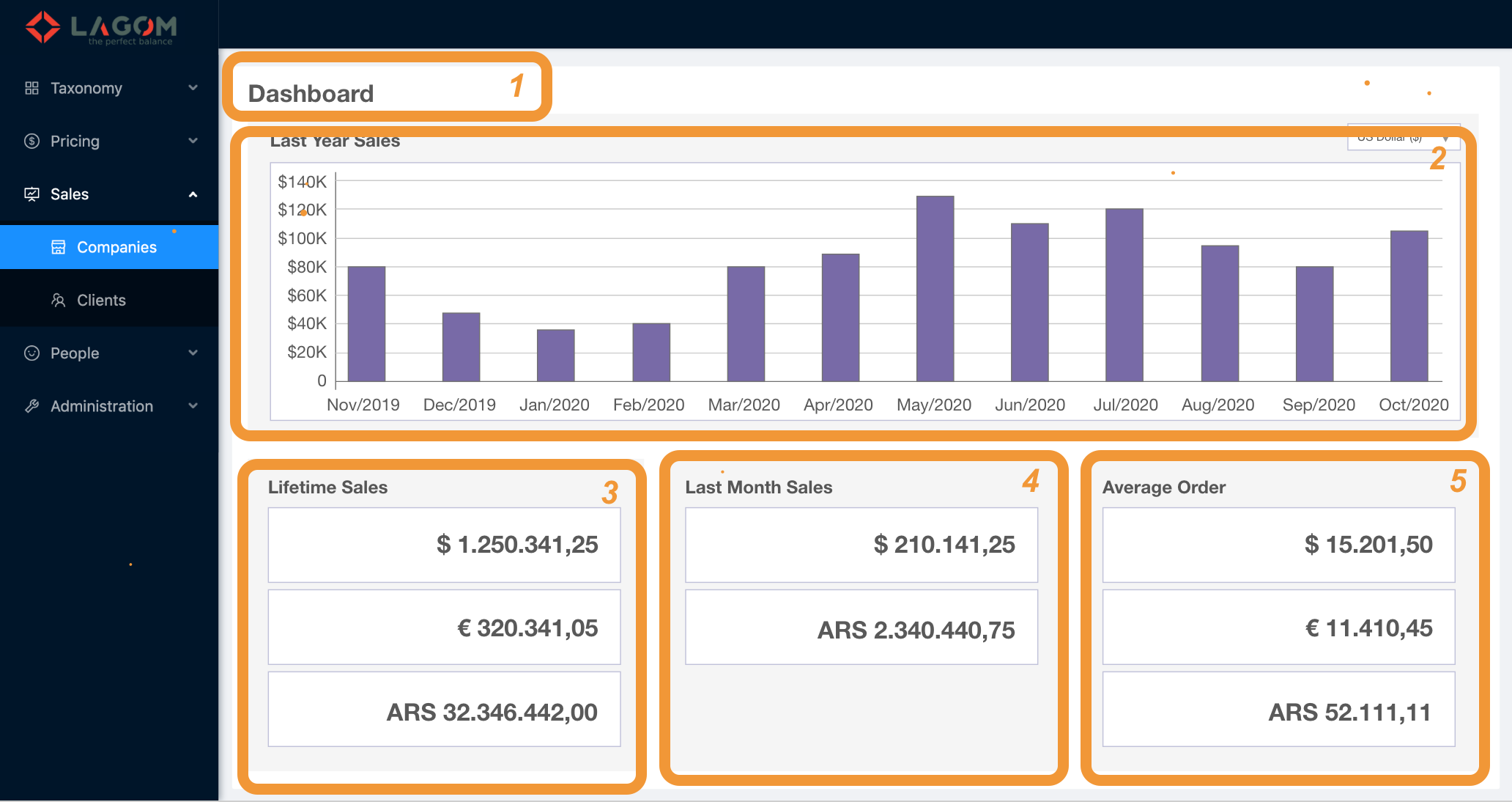
¶ 1. Title bar
A fixed title "Dashboard".

¶ 2. Chart
The Chart section shows a bar chart with the sales from the last 12 months.
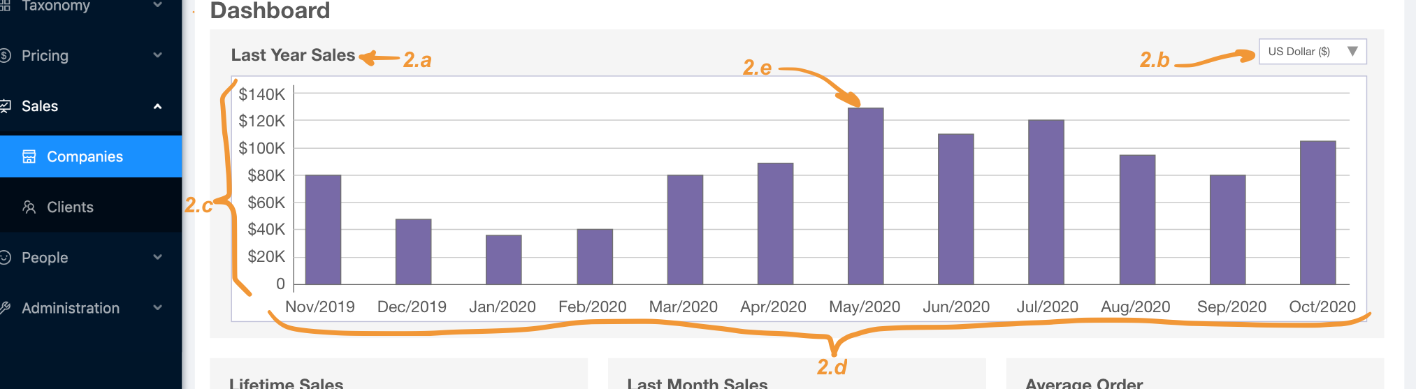
2.a. Section title "Last Year Sales".
2.b. Currency selector dropdown:
- The options in the dropdown are taken from the API. Integration:
response.currencieswith the template<name> (<symbol>). - When changing the selected currency, that chart data is updated with the corresponding information.
For example, here the original view of the page in USD has been switched to show the information for the currency Euro:
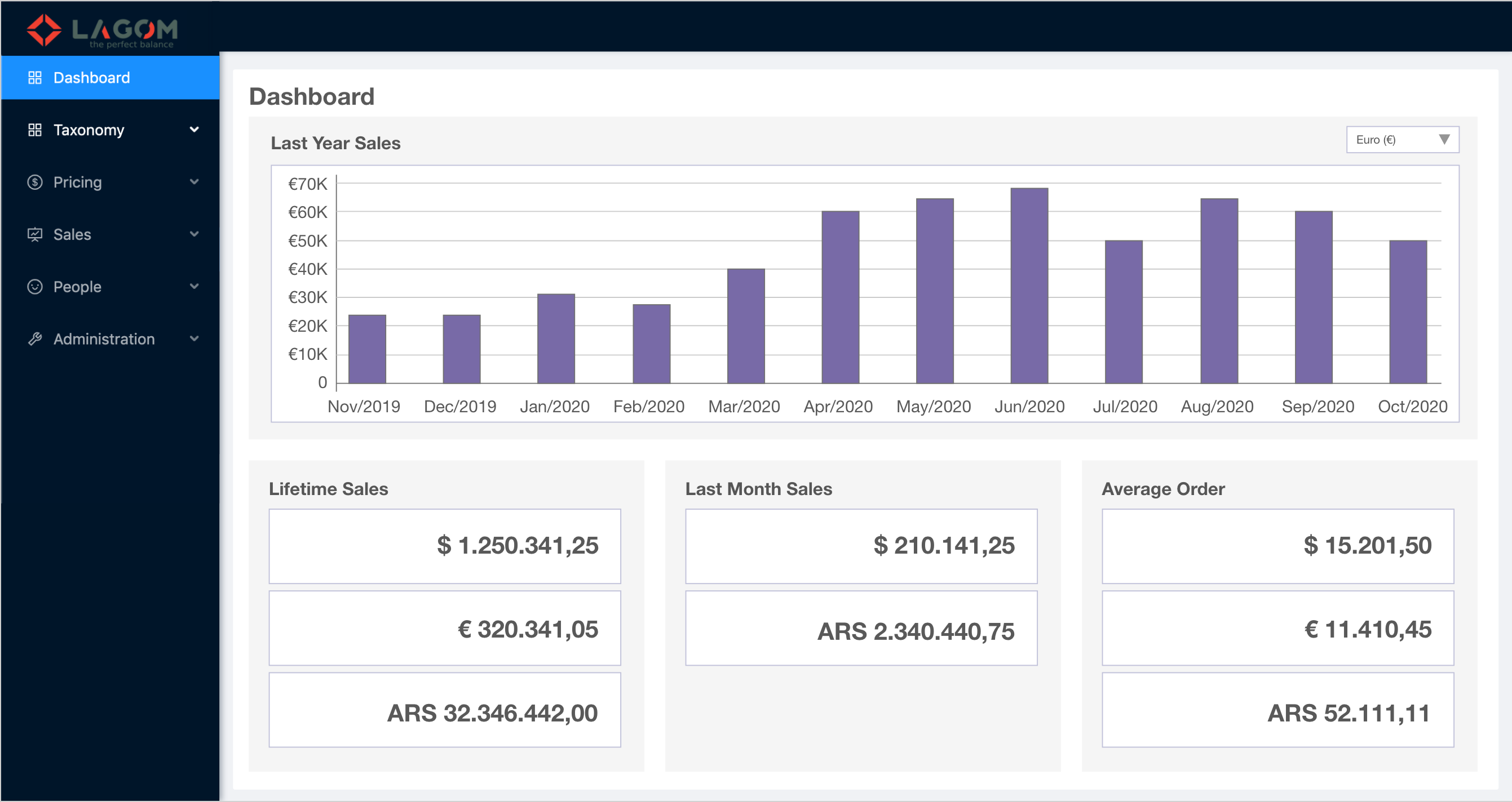
2.c. Y-axis with the money scale:
- The scale is automatically adjusted according to the maximum value in the selected series (the lowest value will be always 0). Integration: The maximum value can be calculared from
response.timelines[<index>].data[<maxIndex>][1]. - The Y-axis unit is the selected currency (see 2.b).
2.d. X-axis with the time scale:
- The scale goes from 12 months ago (since current date) up to the current month. For example, if today is 15th October 2020, the axis will go from Nov/2019 (12 months ago) to Oct/2020 (current month). Integration: The labels can be taken from
response.timelines[<selectedIndex>].data[<index>][0].
2.e. Data bars. These are the bars that depicts the information being proportional inn hight to the sales of each month.
Integration: The values are taken from response.timelines[<selectedIndex>].data[<index>][1].
¶ 3. Lifetime Sales
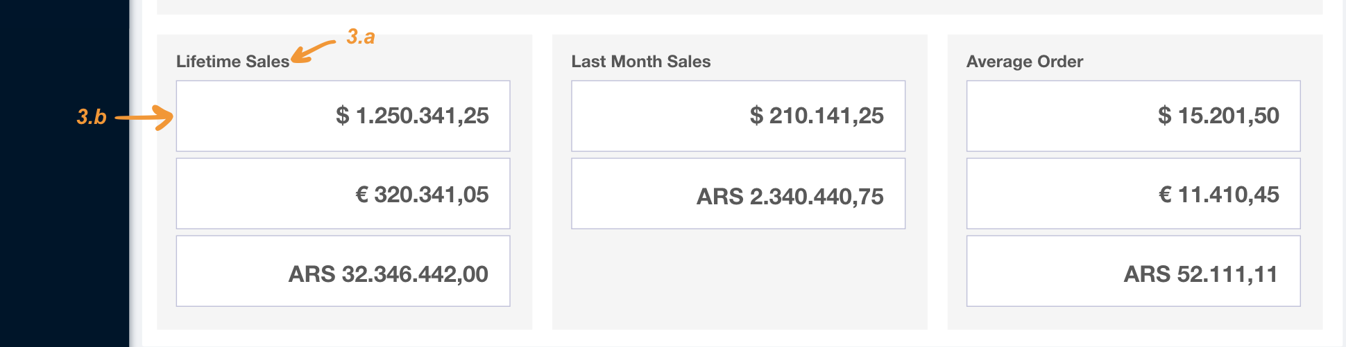
3.a. Section title "Lifetime Sales".
Integration: The title is taken from response.totals[<index of code "lifetime-sales">].title.
3.b. Summary Cards. They shows the total amount of money from orders placed in different currencies.
- The API could return many totals that must be shown as cards. Integration: totals are returned in
values. - The API will return always at least one total.
- The totals returned from the API will include the numeric value and the related currency. Integration: totals are formatted using the currency symbol in
response.currencies[index of currency].symbol.
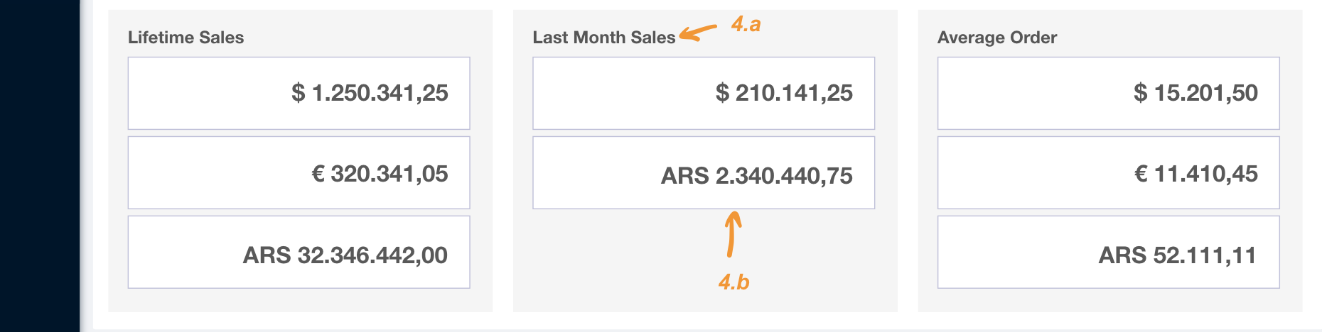
¶ 4. Last Month Sales
4.a. Section title "Last Month Sales".
Integration: The title is taken from response.totals[<index of code "last-month-sales">].title.
4.b. Summary Cards. They shows the total amount of money from orders placed in different currencies for the current month.
- The API could return many totals that must be shown as cards. Integration: totals are returned in
values. - The API will return always at least one total.
- The totals returned from the API will include the numeric value and the related currency. Integration: totals are formatted using the currency symbol in
response.currencies[index of currency].symbol.
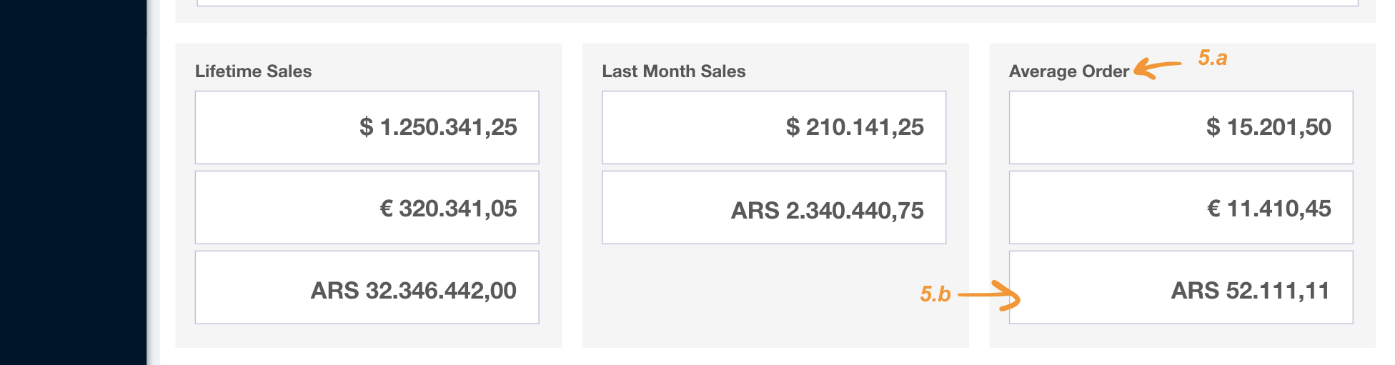
¶ 5.Average Order
4.a. Section title "Last Month Sales".
Integration: The title is taken from response.totals[<index of code "average-order">].title.
4.b. Summary Cards. They shows the average amount of money from orders placed in different currencies.
- The API could return many totals that must be shown as cards. Integration: totals are returned in
values. - The API will return always at least one total.
- The totals returned from the API will include the numeric value and the related currency. Integration: totals are formatted using the currency symbol in
response.currencies[index of currency].symbol.